
Project
Library Catalog
Client
Wayne State University Library System
Summary
Working within the existing Sierra WebPac, my team redesigned the library catalog using weekly guerrilla tests.
Background
After finding success with our user-driven redesigns of the Wayne State University Library website, the web team decided to tackle a more complicated project: the library catalog. Though the application met the needs of library staff internally, the design of the front-facing catalog left a lot to be desired. Existing customizations were limited to minor CSS edits, and even with those the catalog looked exceptionally out of date compared to the rest of the website. Which makes sense, considering how it had gone untouched since 2006.
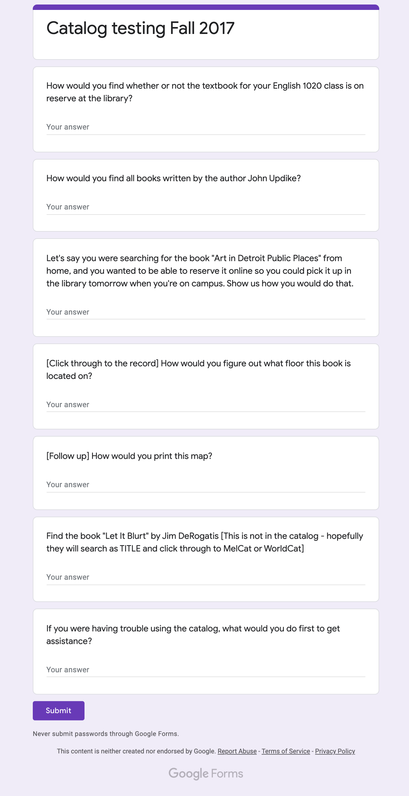
Before we began testing, we communicated with reference and circulation staff to identify user needs, and created the first of several scripts in Google Sheets to guide our testing.
From there, we started running guerrilla-style user tests, revealing several issues with the design we’d had for over a decade, long before any of the current web team members were working in library.
Our goal for the redesign was simple enough: improve the style and usability of the catalog while retaining functionality users expect. Easier said than done, though, especially considering our limited resources and the confines of an existing platform with a default skin that looks straight out of the 90s. We had to work smart, and do what we could with what we had.
Identifying Problems
Even before we put it in front of users, it was easy to identify major issues with the catalog.
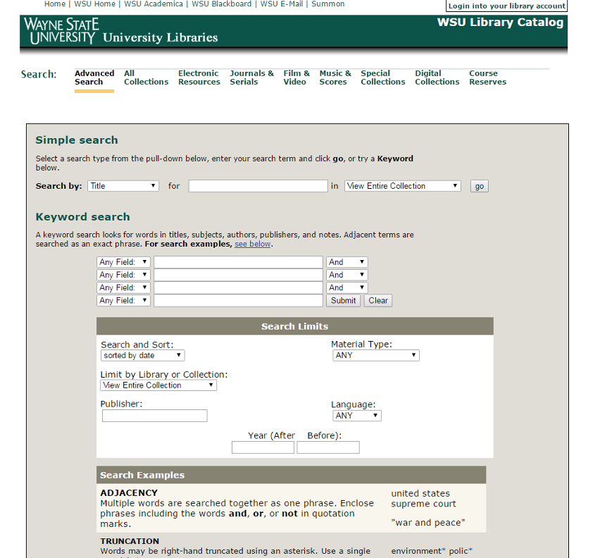
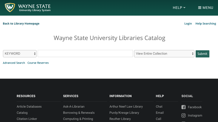
We started with the catalog homepage. The global header had outdated branding, “simple search” was misleading and vague, and the page lacked a “help” section.
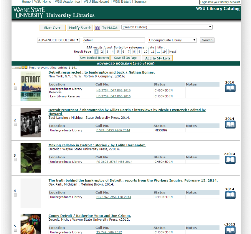
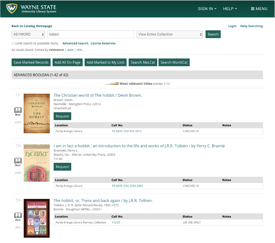
The search results page suffered similarly. Major issues included an unintuitive menu layout, inconsistency in language (“ADVANCED BOOLEAN” vs. “Keyword”), and mislabeled links (“Modify Search” actually led to an advanced search option).
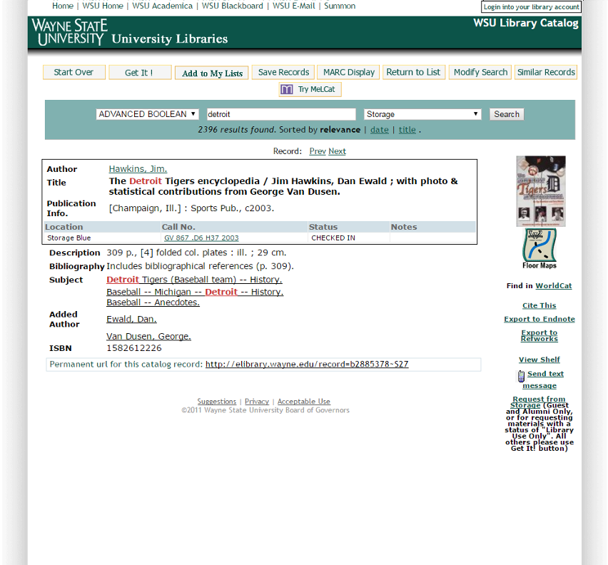
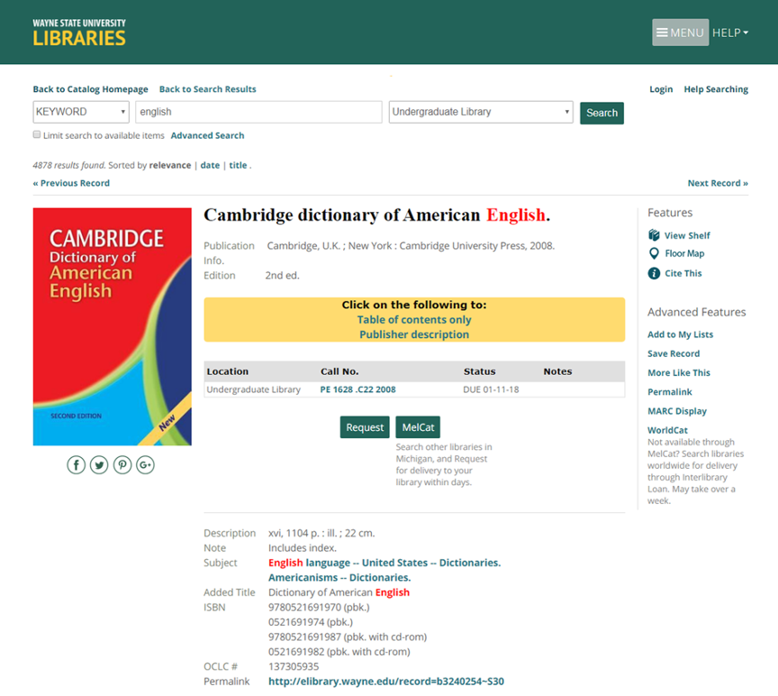
Finally, our testing quickly identified the following problems with the record page: The menu layout wasn’t intuitive; students don’t know what “Get It” means (and can’t find it); students have trouble locating MelCat and WorldCat; features like “Floor Maps,” “Cite This” and “View Shelf” could be better utilized.
To-Do List
- Update style and layout to match main website
- Add an actually helpful Help page
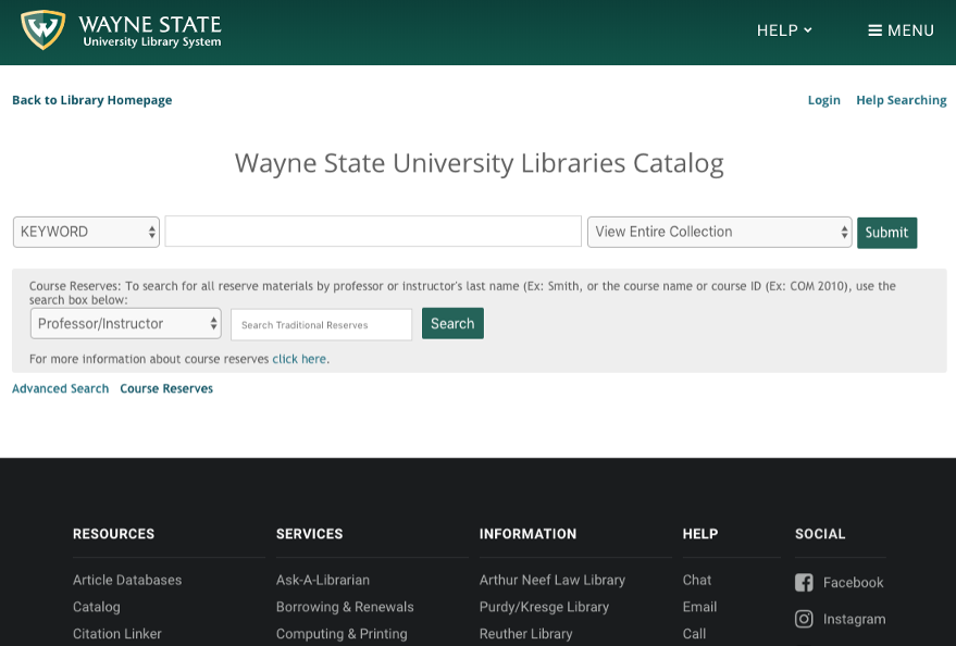
- Incorporate Course Reserves
- Make it easier to request books
- Better integrate Floor Maps, Shelf View, and Cite This
Implementing Changes
User feedback in hand, we redesigned the catalog to modernize the look, improved user-friendly features like citation and map tools, and tweaked language to be more intuitive for users.
Every time we made a change, we put it in front of users for quick, guerrilla style testing. We also ran prototypes past library staff to ensure the functionality they relied on was still available. No edit made it to the final version unless it was proven to be a successful update.
It is important to note that there was often a disconnect between what we wished we could do and what was actually possible within the catalog application. If we had more time, money and staffing to devote to this project, I’m sure we would have been able to customize the application more fully, utilizing Sierra’s API and developing an alternate code base. But because our team and resources were limited, we chose to work within the structure of the existing application, developing custom Javascript and CSS to modify the interface to the best of our ability.
Changes to homepage:
- Updated logo, branding, and menus
- Changed default search to Keyword
- Added Help section
- Tooltips for search guidance
- Course Reserves link
Changes to search results page:
- Updated navigation
- Changed “Modify Search” to “Advanced Search”
- Added “Request” button to search results page
- Increased size of images and text
- Moved media type icon to left of results
Changes to record page:
- Larger images and text
- Social icons
- Separated tasks into “Features” and “Advanced Features” and created new side navigation – links are categorized so users can better locate features
- Replaced “Get It” with “Request” in middle of page
- MelCat and WorldCat are more prominent, have explanations
Takeaways
With only three staff members on the project (only two full time and all with other responsibilities) it was a challenge at times to work within the existing system, especially since it had been untouched for over a decade. These changes wouldn’t have been easy to approach as a single redesign project, but by making small changes iteratively and creatively, we found success.
When we changed “Get It” to “Request” I remember getting a call from our Law Library on campus. A staff member from circulation wanted to notify us that an error had occurred in the catalog, presumably from our redesign, and students were erroneously placing requests for non-requestable material. Upon further investigation, we discovered that the material in question had been requestable via the catalog all along. Users just couldn’t figure out how to do it, so the issue never came up. In turn, the Law Library had to review their request policies for accuracy and usefulness.
I never imagined our redesign would lead to policy review, but the fact that it did is a true testimony to the importance of user feedback. Even small changes can have a large impact!
With that said, I believe there is still room for improvement in the current catalog. I wasn’t the lead on this project, and if I could go back in time I would prioritize mobile-first design. While it’s certainly usable on mobile, it leaves a lot to be desired. Thankfully, though, if we learned anything from our first redesign of the library catalog, it’s that a solution is within reach — we just need to listen to our users.